ARTISTS INTERVIEWING ARTISTS
The Clemente 2021 Open Studios
NICOLE PARCHER and ELISABETH CONDON interview KYLIE HEIDENHEIMER. January, 2021

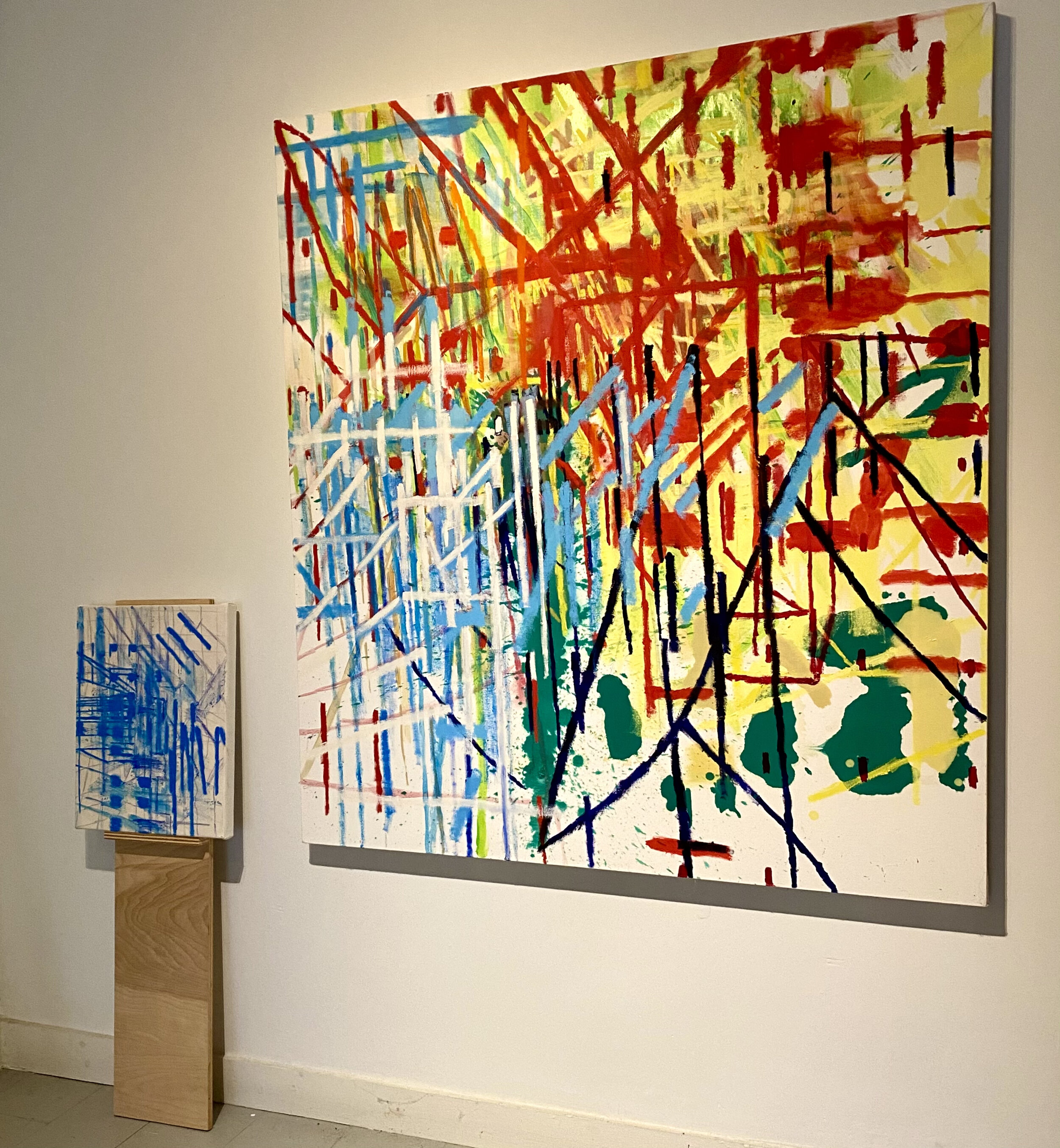
Kylie Heidenheimer, SQUALL, 2020, oil on canvas, 60 x 60 inches

Kylie Heidenheimer, PYRE II, 2018, oil on canvas, 68 x 53 inches
Nicole Parcher (NP)
Kylie, the two pieces I have chosen from your body of work are the recent paintings Squall, 2020 oil on canvas, 60 x 60 inches and Pyre II, 2018 oil on canvas, 68 x 53 inches. These paintings throb and move as the soft blurry marks interplay with the sharp crisp lines. I have a real visceral feeling when I look at your paintings, the brush marks seem to be almost slash marks, they cut and slash across the canvas, they are sharp, almost violent. This is most evident in Squall with the use of Alizarin Crimson, giving the marks a bloody feel. How does this gesture and act of cutting come into your work? Are the works of Lucio Fontana relevant to your paintings?
Kylie Heidenheimer (KH)
Nicole, I think of the slash marks that you are seeing as incisions. Camilla Fallon and I curated the 2019 Clemente show, Incise, Echo and Repeat. These types of marks are, in relation to areas like the blurs, clean, new and deep. They can, as Elisabeth cites later on, be parallel across an area. A plane forms. It is transparent, interweaving and cuts through to endlessness. These broad areas can be significant in helping define the painting. This kind of carved line-making also conveys a personal longing. The way Joyce lived in Paris to write about Ireland, I focus via the incised lines on a printmaking past. Specifically, the clean newness and infinite deepness of the acid-bit line. I find it satisfying to translate that kind of drawing/ carving onto canvas. I think it’s great that you asked about Fontana. I have never thought there might be connections between our work. While I certainly see almost all paintings simultaneously as sculptures, I don’t think I do to the extent Fontana might. His surfaces strike me as fairly impenetrable. I see my work as going atop and under the surface. I associate the Alizarin, which is at times mixed with white, with pink colors. Even with red cadmium marks in paintings, I think foremost of a landscape/ air type of space. I would for these reasons, say no to any intentions suggesting violence. I am generally looking outside of and away from the body rather than toward it. That said, I am very interested in my work having both a visual and visceral impact. I certainly want a viewer to experience it both of these ways.
(NP) In Pyre II, there is a buzzing almost electric energy as the contrasting blue and orange lines dominate the painting. In both paintings there is a static electricity, a spark, a downpour of rain slashing across the white canvas. Can you talk about the use of color in your work? The choice for a more monochromatic palette at times, such as in Squall. How does drawing influence your work and the decision to leave sections of the canvas unpainted?
(KH) I am loosely working off of the color wheel. Analogous vs complementary colors, for example. In the case of Squall, colors are mostly analogous. It is a way to make something that is more intimate. It is also a break from louder color complements within some of my other works. When white is mixed in, as it is with Alizarin in Squall, I see it as a way to have a dialogue with the support’s white. To compress any space inbetween. I am glad that with Pyre II, you mention buzz and electricity. I am after tension. The sensations you describe, fit. Inspirations similarly include the “noise” of a Burchfield sky. There is something very personalized in that kind of sought imagery to me. I was ecstatic when Robert Gober brought his paintings back into contemporary art dialog. I love this kind of cross art connection. Breaking down of categorical definition.
The adjoining middle blues and oranges in PYRE II are together to equal each other out. They are “fair matches” for one another. That is perhaps what causes buzz. I don’t set out intending to leave white. But often I choose saturated colors that can stand up to its intensity. When that happens, I don’t always or readily see justifiable ways to “cover” something that is at that juncture, exerting its purpose. I have since 2015, very much been bringing drawing to the work. Its recent use came quite urgently into being. I was sorely missing direct contact with the support. My work for the prior ten years entailed approaches such as pouring that were “hands off”.
Kylie Heidenheimer,Galerie Gris, 2021. COURSE, 2020, oil on canvas, 20x 16 inches, HEDGE II, 2019, oil on canvas, 68 x 53 inches

Kylie Heidenheimer, COURSE, 2020, oil on canvas,
20 x 16 inches
(NP) I would also like to briefly discuss your current exhibition at Galerie Gris, in particular your installation of Hedge II, oil on canvas, 68 x 53 inches, the large painting next to Course (blue), oil on canvas, 20 x 16 inches. The small painting is on a pedestal next to the larger painting hung on the wall. What is the relationship between these two paintings? What changes when a painting is treated more like sculpture? What led you to make this choice?
(KH) It was the gallery’s idea to install the pieces this way. I am very happy with it. There are often marks on/ in my paintings that allude to what’s outside them. In this instance the diagonal whites in connection with the pale blue verticals underneath make the smaller left Course appear as an appendage of Hedge II. I’ve already mentioned how I also see paintings as sculptures. An added component here for me would be installation. I am also starting to see the work as a single piece.
(NP) I am very interested in the space in your paintings, the paintings seem to pull in different directions, take over the canvas in different ways, lean to the left or right, fall from the top. They have a weight to them, a mass. I think of early Mondrian and Joan Mitchell and Guston’s early abstractions. How do you think about space? Is it intentional or does the painting move in one direction or another as the work is in process?
(KH) I see space as malleable. It intertwines with materiality in the work. It does as you say, pull (and push) in different, opposing directions. Space also for me depicts infinitude. Elements within the work ultimately sync with a primary wresting and twisting of space/ materiality. My 2009 solo show at Thomas Jaeckel Gallery was called RIFT. In compiling the press release, there was discussion that predominant planes in the work hinge at the center and then see-saw forward/ backward. Surface is seemingly in perennial dialog with the bottomlessness of its infinite opposite. The weight and mass you identify is likely me seeking how in the work, to express things viscerally. I very much appreciate you connecting the work with early Mondrian and earlier Guston. Mitchell too. All three for the reasons you mention, ring as true. I want weight and mass, without literally depicting it, to have the impact of a heaved boulder pushing through to the other side of a canvas. The more I think of multi-directionality, the more I think that it mirrors reality. Social codes are never entirely identical for any two individuals. Does that mean codes and signs don’t really exist? Or they may not exist beyond any kind of archetype? We are now further siloed by social media. The pandemic silos us still more. It increasingly compels us to further identify and act on injustice. I feel as well, that we are pressed to acknowledge the part of humanity in us that is atoms bouncing off each other. Possibly even off our respective silos!

Kylie Heidenheimer, HEDGE III, 2019, oil on canvas, 52 x 43 inches

Kylie Heidenheimer, HEDGE II, 2019, oil on canvas, 60 x 54 inches
Elisabeth Condon (EC)
Kylie, Are the two Hedges related, and how? Were they made at the same time? Do they derive from nature?
Kylie Heidenheimer (KH)
Elisabeth, the paintings were made at the same time. As I mentioned briefly above, I think foremost of a landscape/ air type of space. It would be in that respect that they derive from nature. Interesting that you ask if Hedge II and Hedge III are related. There are a lot of similarities with regard to color/ intensity/ saturation. Yet Hedge III remains more vertical and open-webbed. This piece also began with a large central pour. (The underlying Cadmium Orange.) It was originally more landscape in feel. Hedge II began with a vertical Forest Green. It was more calligraphic. Hedge II doubles back more. It begins to go out, to leave the support. It then reverts back in. In that respect, the two pieces differ.
(EC) Terry Winters tells Jennifer Samet that Cezanne makes a new optic of nature, that painting provide images and views that are not available to us in other ways, for example fracturing the surface to animate space. How does this address your paintings?
(KH) There are certainly things in the work that reconfigure. The twist and wrest of space I mention with Nicole might fall under that. I also want to animate or at least exalt space.
(EC) Why? What about space prompts you to animate it?
(KH) I am not sure if I am exalting or animating space. Possibly both. Either way, I see space as representing infinitude. Perhaps even when we as a species explore it galactically, we are as fascinated with constellating and marking our way through it as we are with what we discover. In that respect, space is fodder to depict, map and to make the intangible tangible. Traversing through it is a way to ultimately undo logic and presumption. Finally, in an ironic turn, it is perhaps conceptually more circumscribed than material and literally tangible things. Unlike actual space, there are likely more limits to depicting and marking ideas of infinitude. Perhaps these limits too are a form of structure.
(EC) Your palette, i.e. the pale yellow in Hedge II, or white grid over clear, unmixed color reminds me of Frank Auerbach's subway landscapes of the 1980s in their use of white as a color distinct from a saturate background. What led to your use of pure, clear color?
(KH) Also in connection with how I answered Nicole, these at-times strong, saturated hue choices are equal matches to a canvas’ starkness. I see them as standing up to each other. White and pale colors on the other hand, visually touch upon or acknowledge the (white) support.
(EC) Your lateral marks across a surface recall Mark Grotjahn or Terry Winters' digital-inspired paintings. For many years, you worked with pours and no brush, also switching from acrylic to oil. How do the Hedges speak to that history, and evolve from the earlier methods? Do you see these paintings as a continuation of New York School legacy?
(KH) I certainly connect with New York School push-pull. Tension is a big component in my work. I utilize push-pull for its tension. I imagine for a viewer, that Hoffman comes particularly to mind as his work is abstract, heavily pigmented and also contains saturated near-complement color relationships. I also think a lot about modern figurative work. Namely its structure and composition. Roualt comes immediately to mind. I sought the untouched pristine in earlier work. I still at times do. However, brush and hand, internally and viscerally, re-demanded a presence. Gut response in part, is also what I want a viewer to experience. This shift began in 2007. First with what I see now as “fitted marks”. Things have since then become more “incised” and “drawn”. At this point, I think areas of paint handling, i.e. the marks you cite, are interchangeable with drawing. The aforementioned pristine are one way the Hedges speak to earlier work. Hedge III is on stark-white 2 inch heavily primed, weighty canvas. I already mentioned I began it with a pure Cadmium Orange Gamsol pour and Hedge II with a pure Cobalt Green pour. It’s place of initial making was also pure/ new. Namely, Yaddo’s just-built Frankenthaler studio. It had sealed floors and moveable walls. Certainly an intimidating place to mess up! Dark green pours at the bottom of the other Hedge, Hedge II also invoke pristine.
(EC) You mention that you look at a figure painting, but your work prioritizes the mark. Does the mark become a kind of figure? How does translating the figure, if you do, reflect daily life in paint? Does the figure inform the verticality in many of the larger compositions?
(KH) I mentioned modern figuration above. I also think figuratively with respect to structures in some kind of scape. So, yes, verticality as you ask, may have a role in this regard. My friend described the work as tapered narrative. I interpret that as a dialog or tension between figurative and abstract. Perhaps this begins to answer your query regarding paint reflecting daily life. The mark, as I’ve already mentioned, is also a form of investigation/ mapping. These concerns for me in addition though, still need to ultimately connect with something more overall and larger. They cannot solely exist within a found-along-the-way isolated context. Lateral mark and drawing as you describe it, may encounter spatial/ physical planes/ infinite and intangible phenomena. I work to somehow emphasize/ engage the viewer via the former. Some of what is going on is a kind of interactive open-source inquiry. Perhaps in these ways too, daily life is reflected or at least marked. While I want to fall right into and inhabit rich paint and color (who doesn't!), it must in order not to be gratuitous, ultimately fall within place and purpose. I see worlds within marks and lines. At the same time, they need to have roles within their surroundings. Finally, other kinds of mapping such as driving/ traveling from point A to point B come to mind. Efficiency and flow do as well.
(EC) Can you talk about the empty unpainted areas, how and why exposing the substrate is important to the composition? Like Nicole, your work reveals over layers and underlayers. Can you talk about how covering and exposure is important in your work?
(KH) Cover and exposure are ways to point to the said thing being covered/ exposed. Each helps define the other. Lines dashing off the canvas are ways to point to what is outside the support. In that regard too, covering works to reveal the latter.

Terry Winters,PARALLEL RENDERING, 1996, oil, alkyd resin on linen, 96 x 120 inches
(EC) Kylie, how do you see, or do you, your work in relationship to Terry Winters telling Jennifer Samet that by the early 1990s he “began to see the total surface as a kind of phase space—an accumulation of actions and information. The resulting pictorial space contains the subject or somehow holds the meaning. Are your marks symbolic, actions, or both?
(KH) I identify with action accumulation within a space. (And at the same time to pointing outside of it.) I do so via a traversing across the canvas. This happens by way of mark and other means. Probably at this point, the interview’s end, it is coming across that I primarily intend for most things in a work to indicate something else. This makes many of a work’s elements indexical. (As opposed to symbolic.) In connection with the Winters piece, I see the latter as going down deep with the intention to stay there. I believe my work undulates. There is back and forth between depth and surface. It is fascinating in the Winters piece how there is strong horizontality and upper left splaying diagonals. Yet, ultimate inclinations as I see them, are extremely downward. There is perhaps at the same time in the piece, connections with the work of me, you and Nicole. Coverings may at times for all of us, point to something else. In Winter’s case, extreme depth. Like a travel to middle earth.